
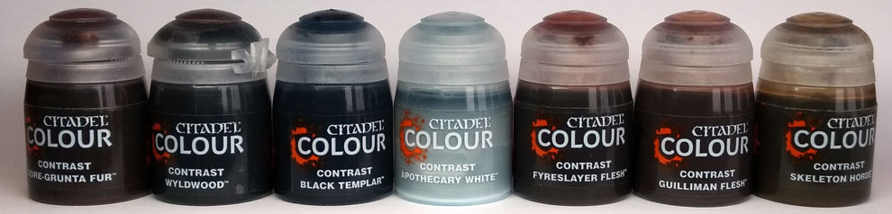
228 : Contrast Paints
There’s been a lot said of Citadel’s relatively new Contrast paints. And rightly so. A good job has been done to produce a set of paints that help get our troops on the table quicker. A very obvious workload in the 10mm 1809 world is the masses of white-coated Austrians that need painted. I gave Contrast paints a shot at helping out.
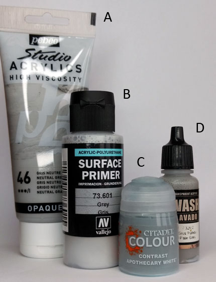
As regular readers of this journal will know, I am a fan of using a khaki undercoat. However, Contrast paints work best with a lighter base-coat. I got hold of a pot of Vallejo grey brush-on Surface Primer (B).
I should say from the off, though, that as much as I’m happy to speed up my painting I’m not qualified to advise on speed painting or, indeed, minimal effort. (That’s another way of saying that I take my time.)
Citadel’s Contrast paints have a wash-like flow, like a thick ink. Using them is like painting with ink. At this small scale, it can be quicker to let the Contrast paint do its job over detail but to then use regular acrylic paint to clean up edges. Saying that, flow is not the issue with 10mm miniatures that it might be with larger figures with pooling on flat surfaces.
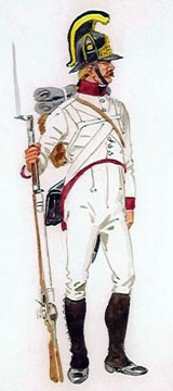
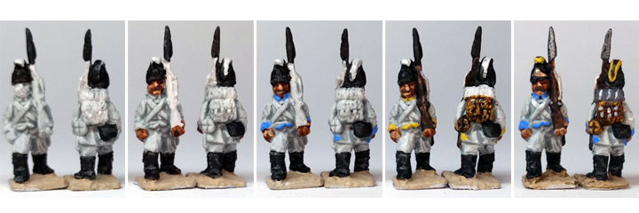
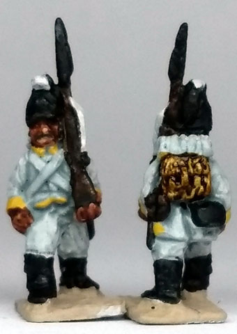
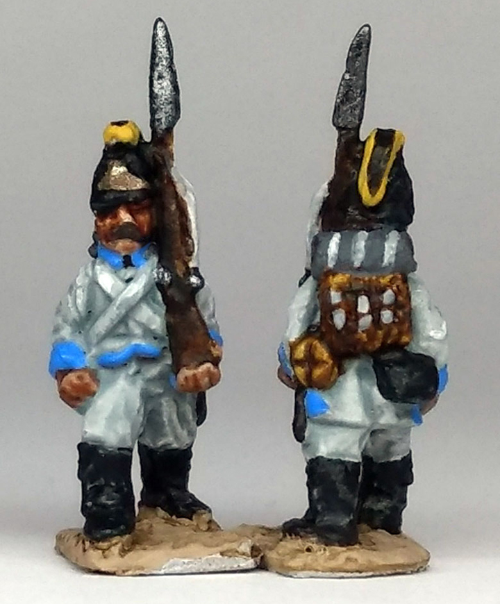
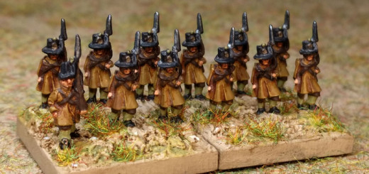
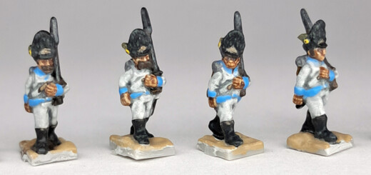
Here, I’m painting Pendraken Austrian marching line infantrymen.
1 I began by washing white Contrast paint (C) over the base-coat. So far, no different from using an ink wash, such as Vallejo Pale Grey Wash (D). Citadel’s Contrast white is a blue-grey wash that produces a cold look. Anyone looking for a warm look might prefer to use Skeleton Horde Contrast paint, but this might be a bit too strong a colour.
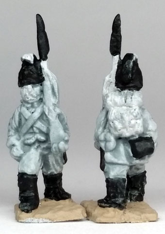
Next, a quick brush of ground colour over the base saves time later. This is something I usually forget to do at this stage!
We’re now ready to paint the black parts. There’s quite a lot of black on an Austrian line infantryman and black Contrast paint does a fine job of picking out the detail of the gaiters, the cartridge pouch and the helmet. It’s not so good at providing an on-the-spot base-coat for the metal of the bayonet, but then, that’s not its job. The bayonet scabbard also needs to be painted black. It’s perhaps easier to paint with regular paint. It should have a very small bit of white strap showing at the top, but this can be covered over with black.
When painting 10mm 1809ers, I usually have a range of ‘neutrals’ – white, greys, and black – close at hand. These are all very cheap tubes of studio acrylics (A). It’s easy to scoop the paint out and add the odd dab – very useful for a quick clean up
2 The face and hands can be handled in countless ways. Even though I own a multitude of Foundry flesh colours, my current go-to Caucasian flesh is a light pinky beige (Vallejo Beige Red 70804) with a wash of Army Painter Flesh Wash. This works well at this scale and very well with my usual khaki base-coat. The grey base-coat here, however, allows a bit of experimenting and Contrast paint does a great job at picking out the detail of the face and hands. I used both the mid-tone flesh colour (Guilliman Flesh) and the dark tone (Fyreslayer Flesh).
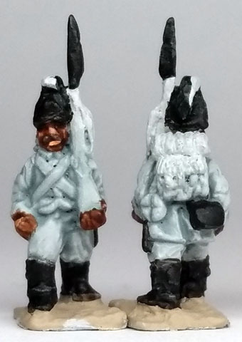
Moustaches are invariably painted with Foundry Bay Brown 42A (one of my must-have paints). This is a soft, slightly transparent, brown so avoids a harsh outline – as does most facial hair. Clean up is now done with regular paint. Any extravagant facial hair can be trimmed with a lip line painted under the moustache with a rosy flesh colour, and a highlight can be added to the nose, which can at the same time reduce the size of a large moustache!
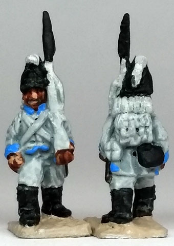
3 The facing colour is painted with regular acrylic paint. I don’t add any highlights to the facing colour.
At this point it’s good to remind myself when painting any marching Pendraken figures to get the neck area painted as soon as possible. This basically falls under the paint-from-the-inside-to-the-outside ‘rule’. It’s not a rule, though, it’s just sometimes advisable. Trying to paint a 10mm collar with the facing colour later will invariably end up messing up an already painted area.
I jab a dab of paint into the neck area behind the backpack, remembering that there is an ear there and that any hair, musket and the back of the greatcoat roll can be disguised with a mid to dark brown. Quite a few Pendraken marching castings suffer from a spill of metal on the left shoulder. It’s too substantial to remove so it needs camouflaged with paint. Brown seems the best choice.
I stopped painting piping on the epaulettes. There doesn’t appear to be a definite uniform rule as to the piping, anyway. The sculpt of the jacket is, unfortunately, not what it should be. The front and the deep slit at the back both show signs of French influence. This is a shame because the Austrian jacket had real character of its own and contributed to a distinctive uniform of the period. You have to cheat the facing colour on the front of the jacket by trying to straighten up the bottom a little and avoid highlighting what looks like a French vest shape. I don’t paint the piping on the back of the jacket but, again, the flat tail of the jacket isn’t there to paint.
4 Next up are the actual brown parts, using brown Contrast paint. There are four brown Contrast paints: one is more yellow (Snakebite Leather), another more red (Gore-grunta Fur), one more blue (Wyldwood), and the last a dark purple-blue (Cygor Brown). These all have their uses and as the colour of the wood of muskets and fur of backpacks were not regimented there is plenty of scope for adding a bit of variety. Here I used the yellow-brown for the backpack. The Contrast paint really comes into its own for fur and hair. I don’t try and avoid the buckle straps, I’ll paint them later with regular paint.
Likewise, Contrast paint adds just a bit of highlight to the musket. A red-brown might be appropriate for a musket but the blue-brown is more useful for speed painting as it provides a good base-coat for the metal parts and can also fill the dip between the face and the musket. I used to paint a metallic line for the barrel of the musket but I don’t now. But this is another reason for using a darker brown. As a real plus, the brown Contrast paints do a great job of giving the water bottle dark straps.
I keep the blue-brown Contrast paint to hand for later as it is useful for the odd touch-up and can quickly tone-down any light-coloured blemishes.
5 I now finish off with regular paints. The yellow of the helmet crest is my favourite yellow – Foundry Lemon 1A – the same colour used for the ‘emperor yellow’ facings.
The greatcoat roll was painted dark grey. I find painting the straps light grey rather than white speeds things up. I used my neutrals – the tubes of studio acrylics always to hand.
Gunmetal paint completes the musket, and a spot is added on the bottle top. A bronze colour is used for the helmet plate. This is a good time to remember to change the water in the water pot after using metallic paint.
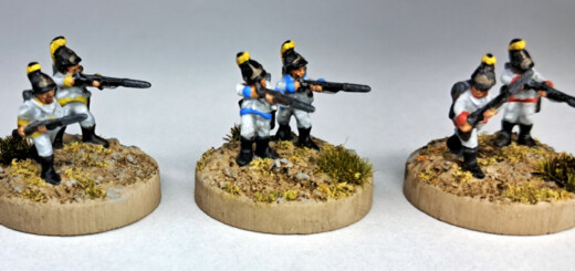
Using Contrast paint certainly sped up painting the Austrian infantrymen. The white coats and breeches were finished off with ease – but no quicker or differently to using existing inks. But Contrast paint really comes into its own with the black, brown and flesh areas. I didn’t have to use up any time highlighting the black parts or the fingers of the hands. However, things slow down somewhat painting the black edge of the gaiters next to the white breeches. This is because of the consistency of the ink-like Contrast paint. However, regular paint is always to hand.
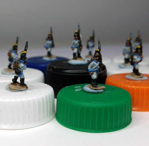
These were actually some of the last 34 Austrian line infantry figures I needed to complete my painting list. If I were to paint anymore Austrian line infantry, that would be the start of a whole new project! But at least I would have the option of using Contrast paints to speed up my painting!
RECENT COMMENTS